
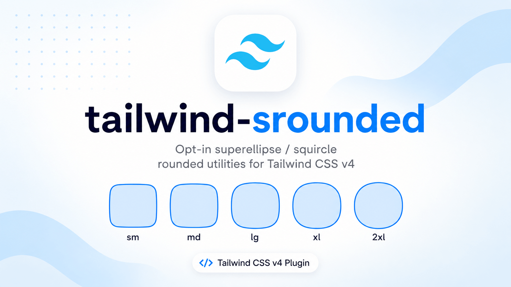
Opt-in superellipse / squircle corner utilities for Tailwind CSS v4.
Use srounded-* anywhere you would use rounded-*. Supporting browsers get iOS-style smooth corners via CSS corner-shape. Everyone else gets normal border-radius. Your existing rounded-* classes are left alone.
<div class="srounded-xl bg-neutral-900 p-6">
  Smooth corners in Chrome. Regular rounding everywhere else.
</div>border-radius draws circular arcs. That is the familiar Tailwind rounded look. A squircle (a superellipse) keeps more of the straight edge and blends into the corner more gradually — the shape used on iOS icons, many system controls, and a lot of contemporary UI.
This plugin:
- Adds
sroundedutilities that mirror Tailwind’sroundedAPI (sizes, sides, corners, logical properties,full,none, arbitrary values). - Applies
corner-shape: superellipse(...)only inside@supports, so unsupported browsers fall back to ordinary rounding. - Scales the radius in supporting browsers (
--srounded-scale) so the squircle doesn’t look tighter than therounded-*size you picked. - Is opt-in. Nothing global is restyled. You choose which elements get the superellipse.
It is a CSS-first Tailwind v4 plugin (@utility + @theme). There is no JavaScript plugin file and no @plugin directive.
| Browser | Superellipse corners | Fallback |
|---|---|---|
| Chrome / Edge 139+ | Yes | — |
| Opera 123+ | Yes | — |
| Safari | Not yet | border-radius |
| Firefox | Not yet | border-radius |
The fallback is the point: srounded-xl looks like rounded-xl where corner-shape does not exist. Layout, shadows, and borders stay intact.
Check live support: Can I use — superellipse().
- Tailwind CSS v4 (
^4.0.0) - A setup that processes CSS with Tailwind (Vite, Next.js, PostCSS, CLI, etc.)
This will not work with Tailwind v3. v3 has no CSS-first @utility / @theme pipeline.
npm install tailwind-sroundedpnpm add tailwind-sroundedyarn add tailwind-sroundedbun add tailwind-sroundedImport it after Tailwind in the stylesheet Tailwind already compiles:
@import "tailwindcss";
@import "tailwind-srounded";
Both of these resolve to the same file:
@import "tailwind-srounded";
@import "tailwind-srounded/index.css";
Do not use @plugin "tailwind-srounded". That directive is for JavaScript plugins. This package is CSS.
Skip this if the defaults work. The plugin already sets --srounded-n: 1.6 and --srounded-scale: 1.6. Override them in your CSS after the plugin import only when you want a different shape or optical size.
@import "tailwindcss";
@import "tailwind-srounded";

@theme {
  --srounded-n: 1.6; /* default — superellipse exponent (2 = squircle) */
  --srounded-scale: 1.6; /* default — radius compensation in supporting browsers */
}| Variable | Default | What it does |
|---|---|---|
--srounded-n |
1.6 |
Superellipse exponent passed to superellipse(n) |
--srounded-scale |
1.6 |
Multiplier applied to border-radius only in supporting browsers |
This is the K in CSS superellipse(K):
n |
Shape |
|---|---|
1 |
Same as normal border-radius (round) |
1.6 |
Plugin default — between round and squircle |
2 |
Classic squircle (corner-shape: squircle) |
> 2 |
Flatter sides, tighter corners (approaches a square) |
Negative values scoop inward. This plugin is aimed at convex squircles; stay in the 1–2 range unless you know you want a scoop.
At the same border-radius, a superellipse looks smaller than a circular arc because more of the edge stays straight. The plugin multiplies the radius by --srounded-scale inside @supports so srounded-xl still reads as “xl”.
- Raise it if corners feel too tight compared to
rounded-*. - Lower it if the shape eats too much of the box.
- It has no effect in Safari/Firefox (they never enter the
@supportsblock).
Theme variables are CSS custom properties, so you can override them on a node:
<div class="srounded-xl [--srounded-n:2] [--srounded-scale:2]">
  Stronger squircle, larger compensation.
</div>srounded-* follows the same naming as rounded-*. Swap the prefix.
| Class | Same idea as | Radius source |
|---|---|---|
srounded |
rounded |
--radius |
srounded-xs |
rounded-xs |
--radius-xs |
srounded-sm |
rounded-sm |
--radius-sm |
srounded-md |
rounded-md |
--radius-md |
srounded-lg |
rounded-lg |
--radius-lg |
srounded-xl |
rounded-xl |
--radius-xl |
srounded-2xl |
rounded-2xl |
--radius-2xl |
srounded-3xl |
rounded-3xl |
--radius-3xl |
srounded-4xl |
rounded-4xl |
--radius-4xl |
srounded-full |
rounded-full |
pill / circle |
srounded-none |
rounded-none |
0 (and resets corner-shape) |
Any --radius-* token you add in @theme is picked up automatically:
@theme {
  --radius-card: 1.25rem;
}<article class="srounded-card">…</article>Physical:
<div class="srounded-t-xl">top</div>
<div class="srounded-b-xl">bottom</div>
<div class="srounded-l-xl">left</div>
<div class="srounded-r-xl">right</div>
<div class="srounded-tl-xl">top-left</div>
<div class="srounded-tr-xl">top-right</div>
<div class="srounded-bl-xl">bottom-left</div>
<div class="srounded-br-xl">bottom-right</div>
Logical (follow writing direction, same as rounded-s / rounded-ss):
<div class="srounded-s-xl">inline-start</div>
<div class="srounded-e-xl">inline-end</div>
<div class="srounded-ss-xl">start-start</div>
<div class="srounded-se-xl">start-end</div>
<div class="srounded-ee-xl">end-end</div>
<div class="srounded-es-xl">end-start</div>
Each of those also has -full and -none (srounded-t-full, srounded-tl-none, …).
<div class="srounded-[12px]"></div>
<div class="srounded-[1.5rem]"></div>
<div class="srounded-[50%]"></div>
<div class="srounded-t-[20px]"></div>These are real Tailwind utilities, so variants work:
<button class="srounded-lg hover:srounded-xl md:srounded-2xl">
  …
</button>.card {
@apply srounded-2xl bg-white p-6 shadow-sm;
}Both families set border-radius. On one element they will fight. Pick one:
<!-- yes -->
<div class="srounded-xl"></div>

<!-- no — both set border-radius -->
<div class="rounded-xl srounded-xl"></div>
Mixing on different corners is fine (rounded-tl-lg srounded-br-xl).
For srounded-xl, the generated CSS is roughly:
.srounded-xl {
  border-radius: var(--radius-xl);
}

@supports (corner-shape: superellipse(1)) {
  .srounded-xl {
    corner-shape: superellipse(var(--srounded-n));
    border-radius: calc(var(--radius-xl) * var(--srounded-scale));
  }
}- Every browser gets a real
border-radiusfrom your Tailwind radius scale. - If the engine understands
corner-shape, the corner curve becomes a superellipse and the radius is scaled. srounded-nonesets radius0and resetscorner-shapetoroundso a previoussrounded-*does not leak.
Side and corner utilities set the matching longhands (border-top-left-radius, corner-top-left-shape, logical equivalents, and so on).
Search the built stylesheet for .srounded-xl (or whichever class you used).
Not there?
- Tailwind v4 is required.
tailwindcss@3will ignore@utility. - The import must live in a CSS file Tailwind actually processes (the same file as
@import "tailwindcss", or a file that file imports). - You used
@plugin "tailwind-srounded"instead of@import. Switch to@import. - The class never appears in a scanned source file. Tailwind only emits utilities it sees. Put the class in HTML/JSX, or add a
@sourcepath. - In a monorepo / UI kit, the consuming app must import this CSS. Installing the package is not enough.
There, but unused in DevTools?
- A later
rounded-*or inlineborder-radiusis winning. - A third-party component stylesheet is beating the utility on specificity. Try
!(next section). - The class is misspelled (
sround-xl,s-rounded-xl).
srounded-* is a normal Tailwind utility, so the important modifier works. Put ! at the end of the class (Tailwind v4):
<div class="srounded-xl!">
  Wins against most third-party `border-radius` rules.
</div>
That compiles to border-radius and corner-shape with !important — including the scaled radius inside @supports. Variants still stack: hover:srounded-2xl!, md:srounded-xl!.
Use this when a library component (datepicker, modal, card, input) ships its own radius and your class shows up in the DOM but the corners stay circular. Do not make ! the default; it is a specificity escape hatch.
! will not help if:
- The painted box is a child (or pseudo-element) the library styles. Put
srounded-*/srounded-*!on the node that actually hasborder-radius, or wrap and round the wrapper if that is the visible edge. - A parent uses
overflow,clip-path, ormaskthat clips to a circular arc. - The library also sets
border-radius: … !importantand wins on source order. Then you need a more specific override, or to stop the library class from applying.
The v3-style prefix (!srounded-xl) still works in v4 but is deprecated; prefer srounded-xl!.
In DevTools console:
CSS.supports("corner-shape", "superellipse(1)")true— you should see squircles. Inspect the element;corner-shapeshould besuperellipse(1.6)(or your--srounded-n).false— you will only see normal rounding. That is the fallback, not a plugin bug. Test in Chrome 139+ or Edge 139+.
On a supporting engine, computed styles look like:
border-radius: /* token * --srounded-scale, e.g. ~19px if --radius-xl is 12px */
corner-shape: superellipse(1.6)
On Safari/Firefox you should see the unscaled radius and no corner-shape.
| What you see | Likely cause | What to try |
|---|---|---|
Looks exactly like rounded-* in Chrome |
@supports block missing from CSS, or an overlay/overflow clip hiding the corner |
Confirm compiled CSS contains corner-shape. Check parent overflow / clip-path / mask. |
Library component ignores srounded-* |
Their stylesheet sets border-radius with higher specificity |
srounded-xl!. Confirm you classed the painted node. |
| Corners look too circular | --srounded-n too close to 1 |
Set --srounded-n: 2 |
| Corners look too boxy | --srounded-n too high |
Drop toward 1.4–1.8 |
Corners look smaller than rounded-xl |
Scale compensation too low | Raise --srounded-scale (1.8–2.2 is a common range) |
| Corners eat the content | Scale too high, or radius larger than half the shortest side | Lower --srounded-scale, or use a smaller size token |
| One corner is round, others squircles | Mixed rounded-* / srounded-*, or a *-none reset |
Use one family per corner |
srounded-full still looks like a circle |
Expected — infinite radius + superellipse still reads as a pill/circle | Use a large but finite radius (srounded-3xl / srounded-[2rem]) for a squircle “disc” |
Tweak live on one node while iterating:
<div class="srounded-2xl [--srounded-n:2] [--srounded-scale:1.8]">
  …
</div>
When it looks right, move those values into @theme.
srounded-* reads --radius-* from @theme. A token named --srounded-card will not match. Name it --radius-card and use srounded-card.
Arbitrary values must be lengths or percentages: srounded-[12px] works, srounded-[var(--my-radius)] needs a type hint if Tailwind cannot infer it (srounded-(length:--my-radius)).
Minimal reproduction:
@import "tailwindcss";
@import "tailwind-srounded";<div class="srounded-2xl bg-black size-32"></div>- Open in Chrome 139+.
CSS.supports("corner-shape", "superellipse(1)")→true.- The box should not look like a plain
rounded-2xldisc-corner.
If that works in isolation but not in the app, compare import order, CSS modules (@reference vs a real import), and any global border-radius / corner-shape rules.
Does this replace rounded-*?
No. It is a parallel, opt-in set. Keep using rounded-* where circular arcs are what you want.
Is this a polyfill?
No. Unsupported browsers get border-radius only. There is no SVG mask or clip-path.
Will box-shadow / border follow the squircle?
Yes, in supporting browsers. corner-shape changes the used box shape, unlike clip-path.
Can I change n per breakpoint?
Yes. --srounded-n is a custom property:
<div class="srounded-xl [--srounded-n:1.6] md:[--srounded-n:2]"></div>Why is the default n 1.6 instead of 2?
2 is a textbook squircle. 1.6 is a bit softer — closer to “smooth rounded” than “iOS icon”. Override to 2 if you want the classic squircle.
MIT